Corporate Digital Brand Identity & Architectural Media Systems
Avolution’s brand language distills the essential simplicity of our most important asset: the driven humans behind it. Each piece has a steadfast logic: the combination of forms and components that create a unique mark—confident, warm, and precise—anchored in our craft. It speaks to how we deliver: with clarity, accuracy, and care.
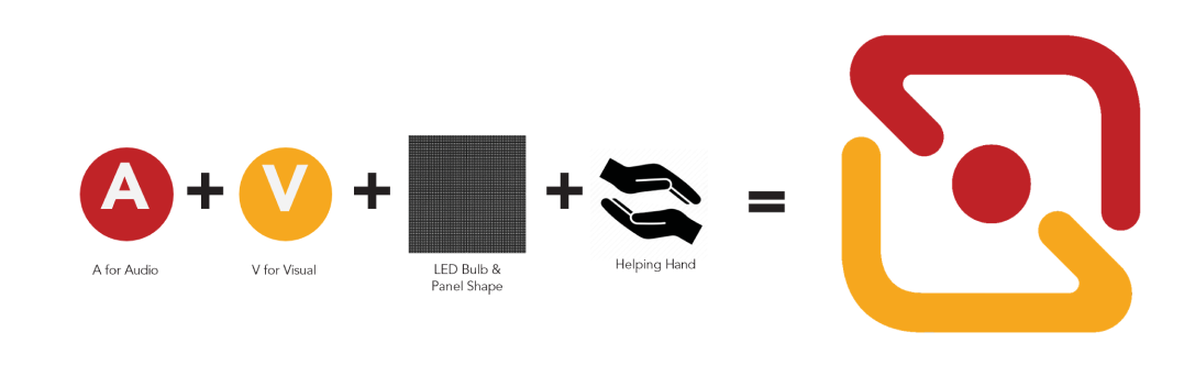
The Lettermark

See usage of this Logo: All Digital and Printed Collaterals (internal and external) All Social Media postings

See usage of this Logo: All events, exhibits, and conferences. All partnership for events, exhibits, and conferences.
Lettermark Colours

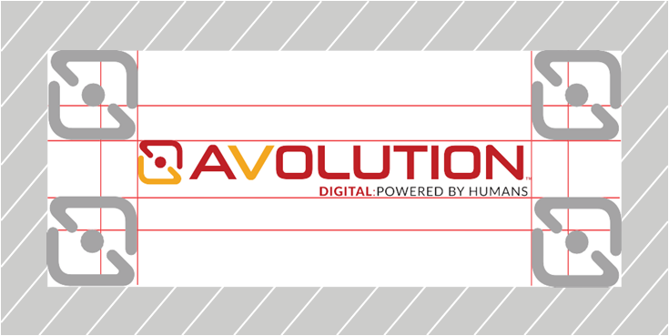
Clear Space
Keeping this space clear makes sure the logo is easy to see and recognize, which is essential for a strong brand. It prevents other design elements like text, images, or other graphics from getting too close and making the logo look messy or unreadable.
Download our branding guidelines
See usage of this Logo: Click the button to download the full version of Avolution Inc. branding guidelines
Download
Request our lettermark
See usage of this Logo: Click the button to download the Avolution Inc. lettermark
Request